

New York designer Jennifer Post sets a Manhattan businessmanÂ’s Miami Beach high-rise home awash in pristine white and bold, bright hues, setting the stage for stunning ocean views. By, Anna Kasabian – Photographs by Ken Hayden

Â
Manhattan businessman John Hannan has a passion for the ocean. His homes on Martha’s Vineyard and his farmhouse in Ireland are directly at the ocean’s edge. His family’s high-rise winter getaway, dubbed Bath House, overlooks Miami Beach. What he particularly loves about this ocean home is that the beach and the city are in one location. Like Jennifer Post, his New York City-based designer, Hannan’s color of choice for the décor in most of those homes is white. The exception is the farmhouse in Ireland, which he says is a “traditional version of an Irish house.” When it came time to build out and design his Miami space, he called Post—and only Post. Present on Architectural Digest’s list of the top 100 designers for the past nine years, Post is known around the globe for her less-is-more design philosoph, and for her signature Arctic-white surfaces and fabrics.
“I saw [Post’s] work in magazines over the years,” Hannan says. “My concept for this space was white…I told her I wanted it to be ethereal, peaceful, and clean. I don’t like clutter at all. I also wanted the space to be easy to be in.”
Â
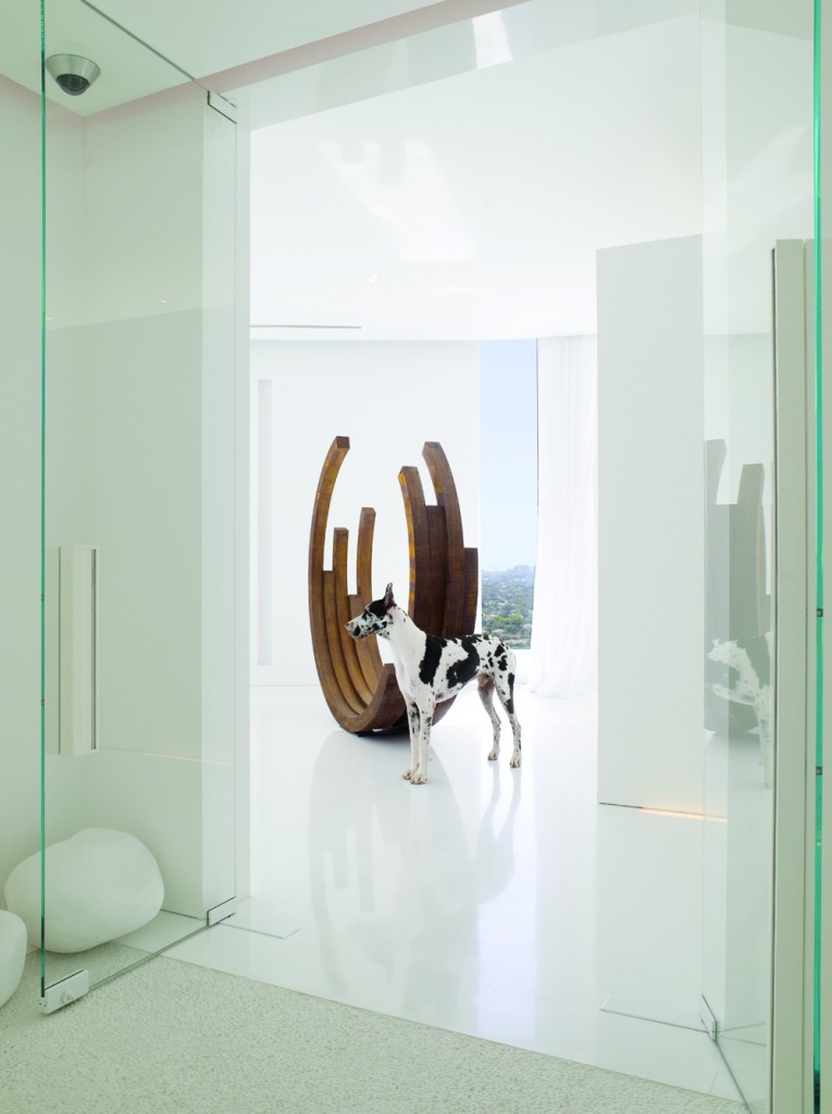
So Post went to work, transforming the 5,000-square-foot penthouse into a sea of calm and captivating views. She used glass panels within the space to keep views open to the outside while defining rooms and their functions. Wide halls and high ceilings lift the space skyward. White lacquered walls, white marble flooring, and PostÂ’s own custom-made white furnishings yield the ultimate in ethereal. Post introduced seductive elements of drama, color, and texture through art. A good example is the steel sculpture she commissioned from artist Bernar Venet; its shape recalls the three-quarter-moon shape of the architecture and suggests the curl of an ocean wave. Furnishings are sleek, crisp, understated, and, of course, as white as sea foam. However, nothing in this design equation competes with the homeÂ’s ocean views.
As do many lavish beach homes, HannanÂ’s is outfitted with guest quarters. At HannanÂ’s high-rise, though, instead of having to traverse a sandy beach path to a private guest house tucked away on a remote patch of property, guest accommodations are separated merely by a hallway and are able to enjoy the gorgeous water views, as well as the understated design theme.
“I liked the notion of the guest house,” Hannan says. “I go there from time to time and the kids have their friends stay there; I like the separation.” Touches of lemon yellow and mango hint that you are in new space, as does its smaller scale and more relaxed style. But still, you know you’re at the Hannans’.
When Hannan does come here, itÂ’s often to practice yoga, making the space, at times, his own seven-room getaway within a getaway. As one who practices yoga daily herself, Post knew precisely how to integrate the yoga area. Thoughtful furnishings, white lacquered walls, and Thassos marble flooring anchor and continue the design theme. Clustered, soft seating keeps things cozy and more casual than in the main house, while pocket doors close off the rooms for even more peace and quiet.
Additional touches in this mini-sanctuary include art, fabric, and bedding, whose color palette is reminiscent of the sand, sea, and sky on a summerÂ’s day. Ligne Roset sofa and chairs in the living room are low slung and clear the way for those astounding water views.
Â
The Rooftop
The crowning jewel of Hannan’s home is its rooftop. “This is a larger space than both of the apartments below,” he says. “At different parts of the day, it can be cooler up there. If you want to see the city, you can find the view. It’s a place we come to read or just hide.”
This is also where Post seized the opportunity to employ a fusion of colors. The shades of blue and orange from the spaces below appear here as well, but they arrive in big, playful swathes as opposed to the more discreet accents used inside.
The rooftop space comprises four bays for entertaining and relaxing, with amenities including a full kitchen, a freestanding shower, and an open-air yoga studio. A 20-foot-high tangerine-colored wall, which Post designed, distinguishes the sections of the concrete rooms and serves as an anchor for additional orange details that appear in the form of fabrics, furnishings, decorative rock paths, towels, yoga mats, and paint.
Of the all three spaces Hannan says, “It’s a very happy place; nothing heavy…a little escape that I don’t get to as often as I’d like.”
Â
On Seaside Design
Thanks to her eye for simple sophistication, Jennifer Post has become one of the design industryÂ’s most called-upon creative talent among oceanfront homeowners. Here, the design doyenne gives a little insight to Ocean Home in terms of must-have options for designing a super-chic beachfront living space.
What are some of the special design considerations for oceanfront homes? The beauty is the ocean, the gloriousness of being there in that state of relaxation—the design has to be in balance with that. I design with furnishings that are lighter in look and feel, more [comfortable] as opposed to formal. I lay the spaces out so that all the public spaces are oceanfront rooms, because that is where you spend your time. I use lighter, less-fussy fabrics, lots of white, pastels, bright yellows, aquamarine, and green—colors that look [good] near the sea and the natural landscape.
So often you get involved in changing the interior layout of a home. What are some of the critical factors for altering oceanfront space? I always make it a point to take the  eye through a room and to the outside view, and having the ocean view makes this even more important. When possible, IÂ’ll make room-to-room openings wide and tall and ceilings high, all to give the space that voluminous feeling. I place all bedrooms with a side angle to the oceanfront or a bay so that they have a glimpse of the sea. Because the ocean view is never more than 180 degrees, I frequently put the master bedrooms on the main level and the childrenÂ’s bedrooms upstairs so all bedrooms take in the view.
What are some of your preferred materials for these homes? I like to use white marble or ceramic in huge slabs so the pattern isn’t noticed. If I use wood flooring, it is light, which is more casual. For kitchen walls, I tend to go white, but for countertops, coral, Caribbean blue, or yellow—those island colors—would work so well. My choice for tile for beachside homes is always something that is easy to clean and in a beach glass color combination. When it comes to fabrics, I always introduce great soft cottons that are maintenance-free.
If the ocean is the main view, when you’re called upon to design the landscape, what are your design priorities? My less-is-more mantra continues here. Grasses, stone paths, plantings, fountains, and even fire pits can all come in to play, either framing a view or enhancing a view from the inside out, or outside looking back to the house. But it is always defined and purposeful, and it always extends what I’ve done inside. It all has to fit and work so your eye moves across a plane without stopping—but in the end, it is a scene that translates the whole experience of being far, far away from the life of jangling cell phones. jenniferpostdesign.com.